Packaging Design for OVME
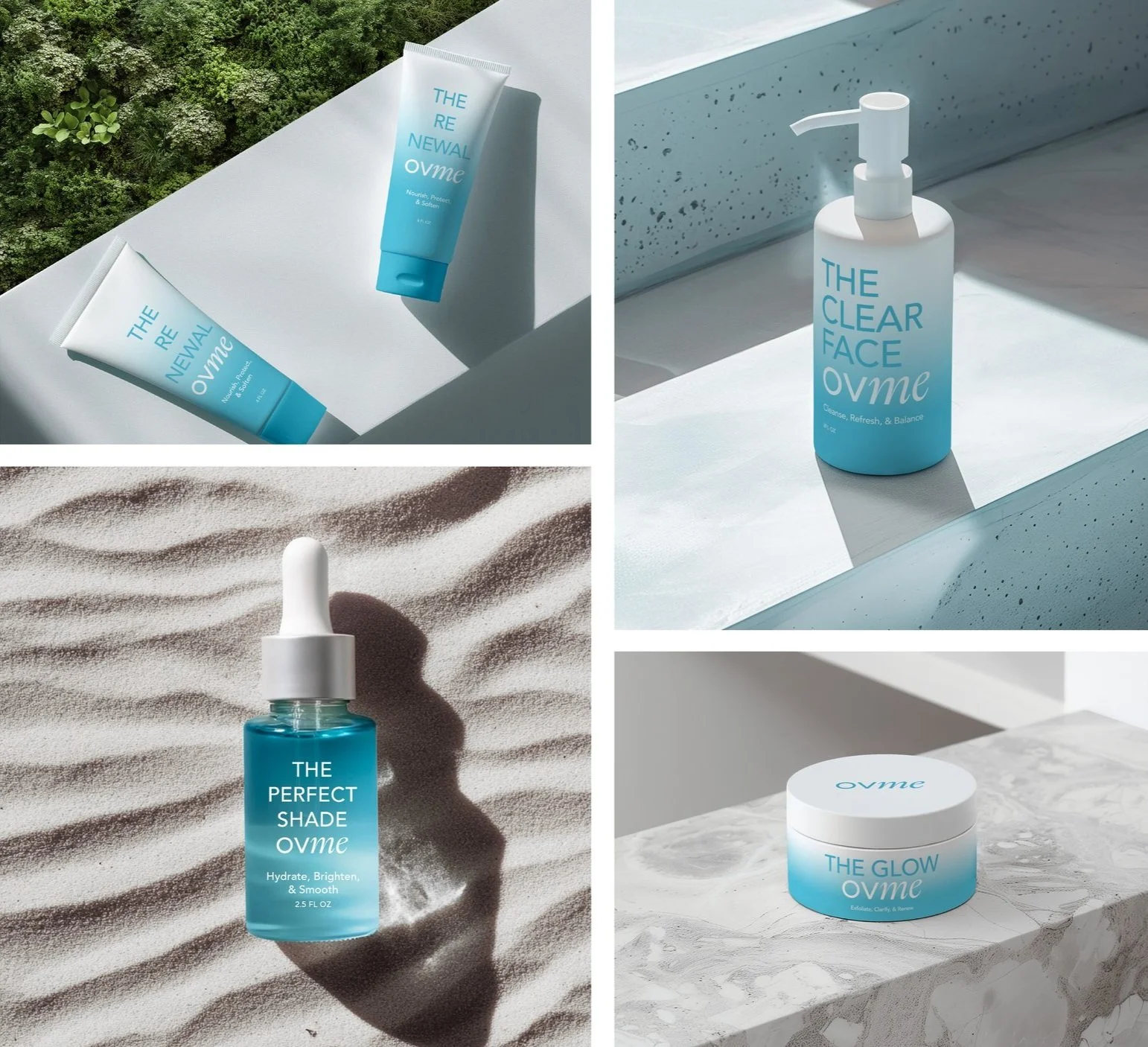
For OVME's product packaging, I aimed to create a sleek, high-end experience that reflected the brand’s premium aesthetic while addressing a key challenge: helping customers better pronounce the name "OVME." To achieve this, I incorporated product names like The Renewal OVME, The Clear Face OVME, and The Perfect Shade OVME—each designed to reinforce clarity and pronunciation while highlighting the product’s purpose. The packaging featured clean lines, refined typography, and a sophisticated color palette to ensure every element, from naming to design, enhanced the customer experience.
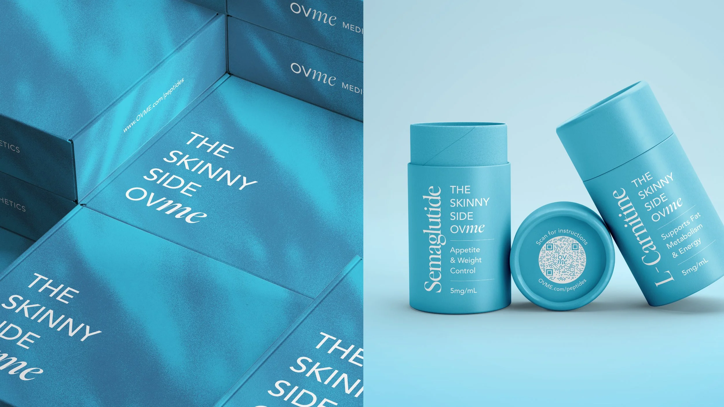
In addition to the product line, I also worked on packaging for OVME’s peptide blends, including Semaglutide and Trizeptide (Ozympic). Given the challenge of branding these pharmacy-sourced peptide bottles, I developed branded packaging tubes with easy-to-access information, including a QR code on the top for seamless customer interaction.


