Refining OVME’s Brand Identity
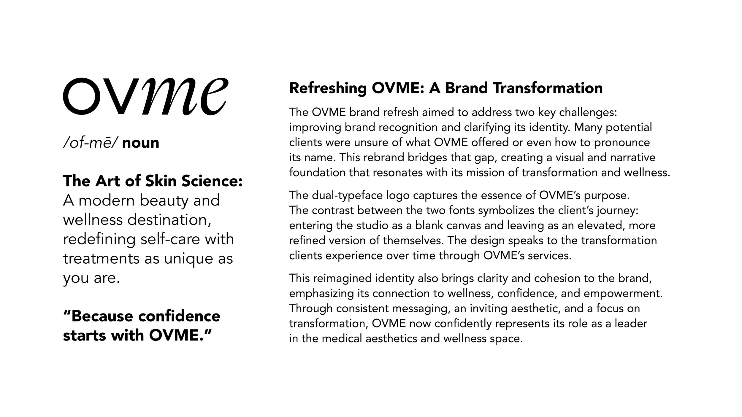
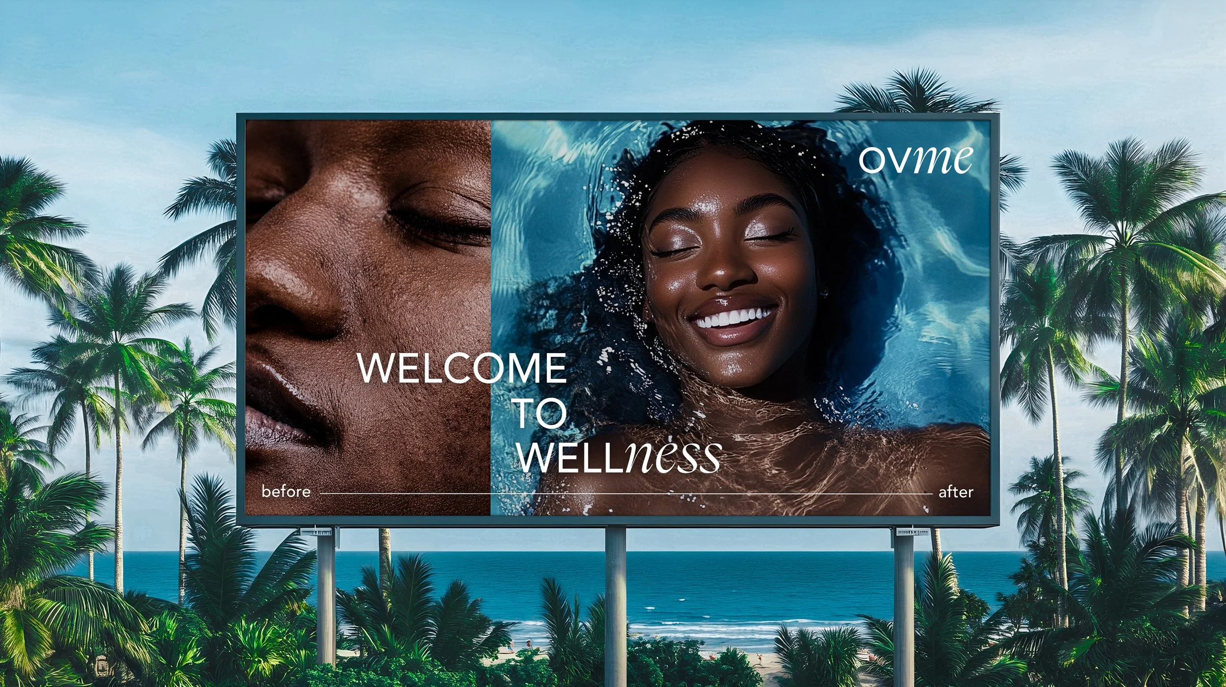
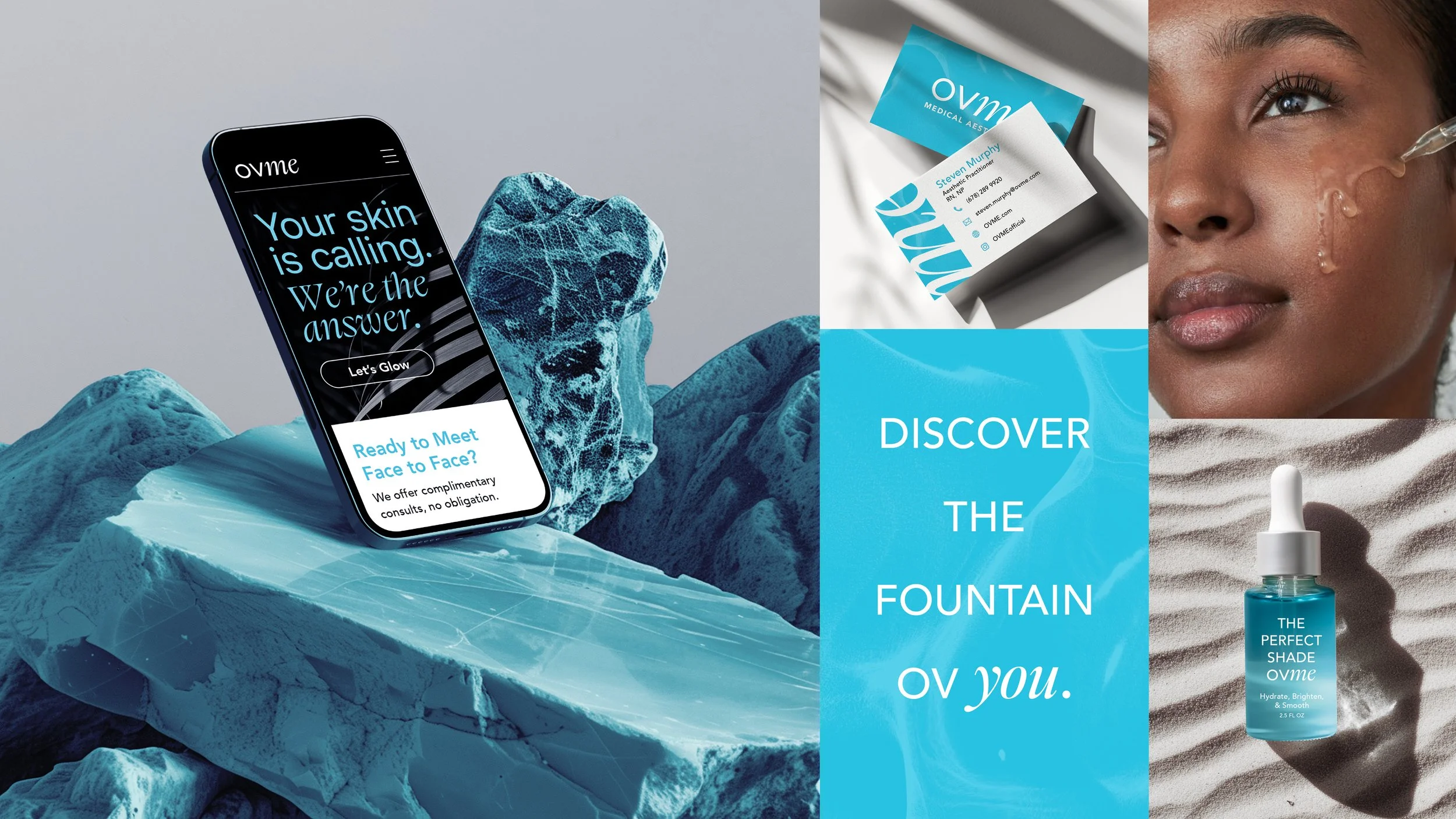
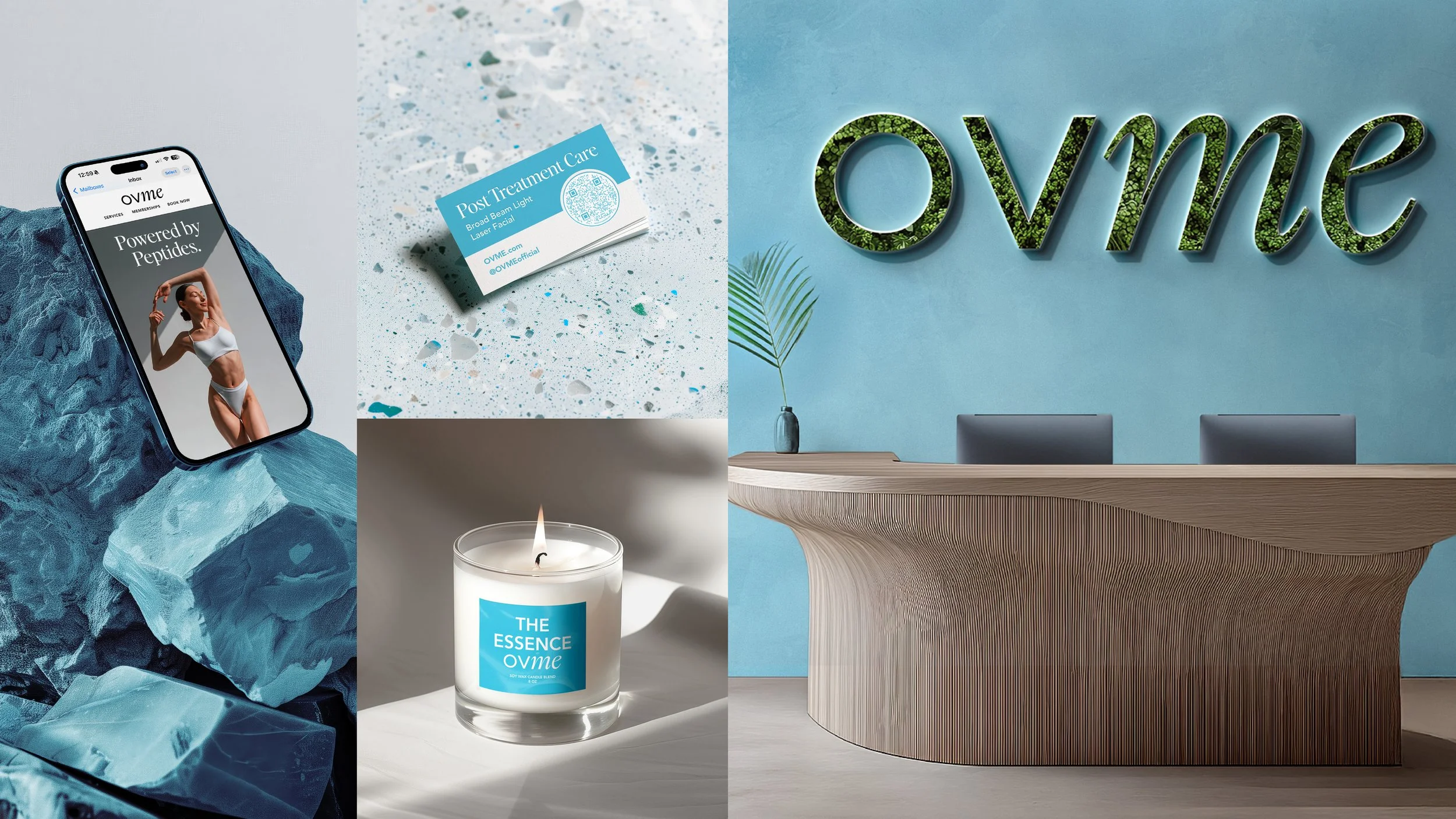
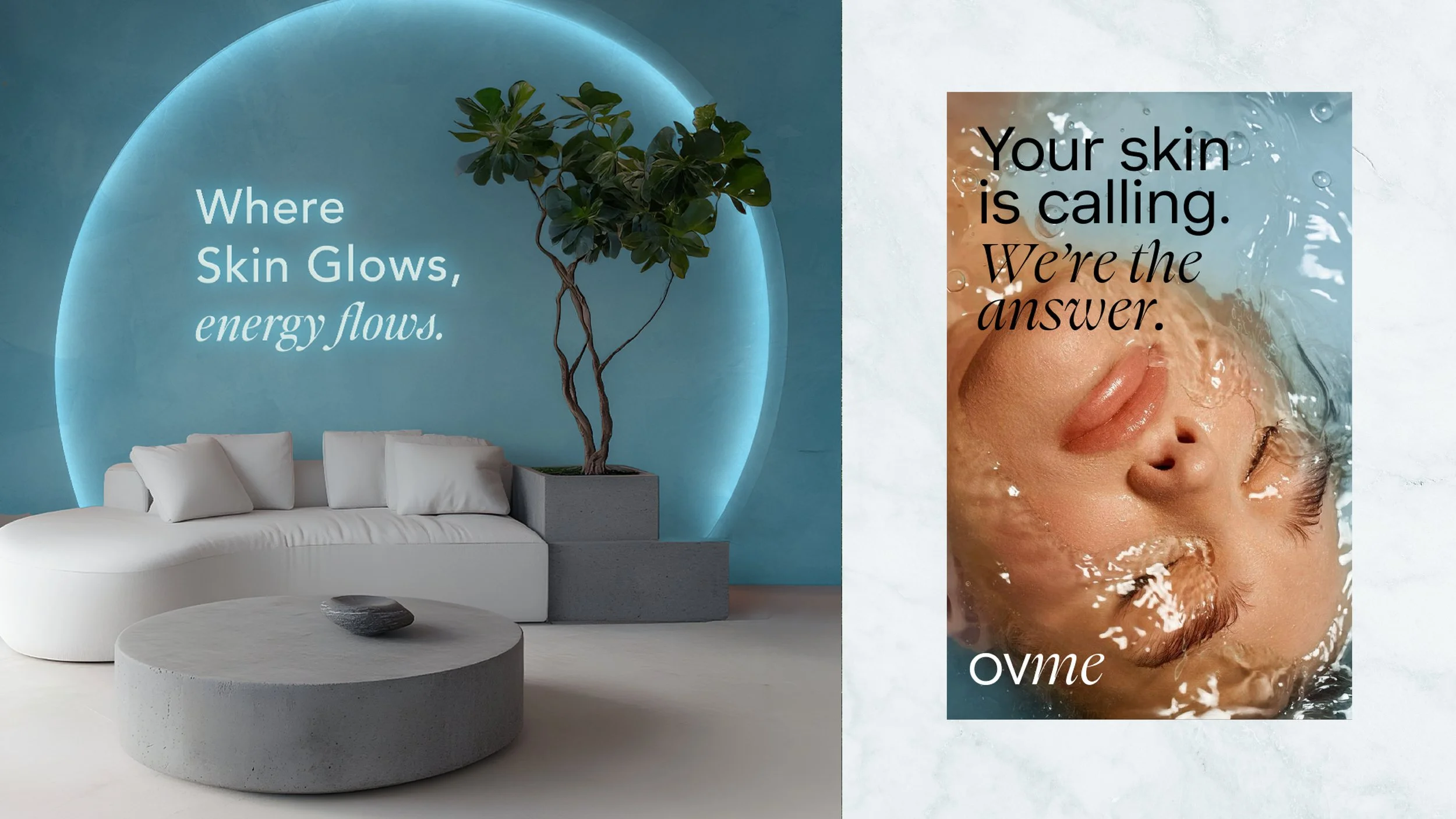
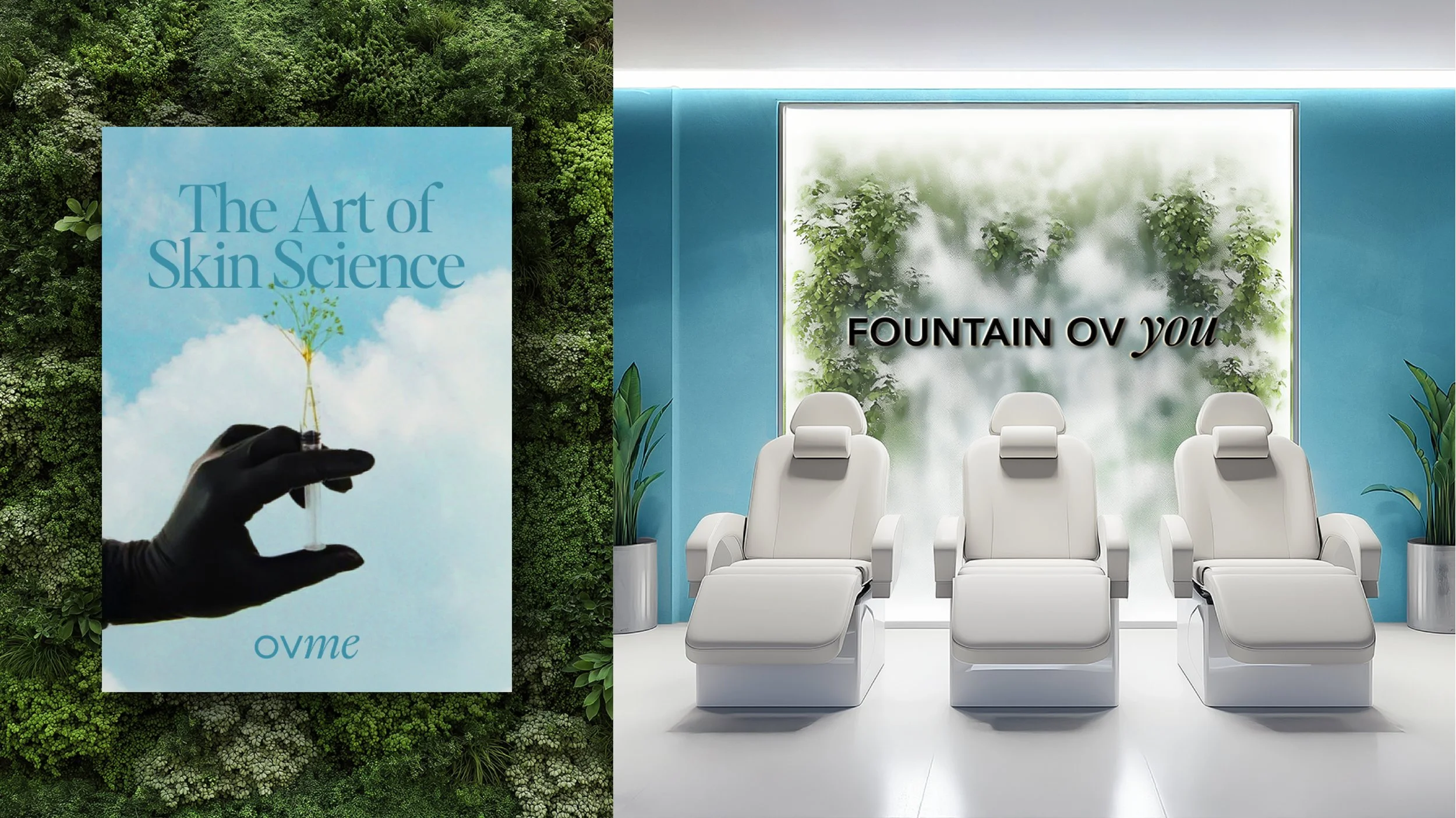
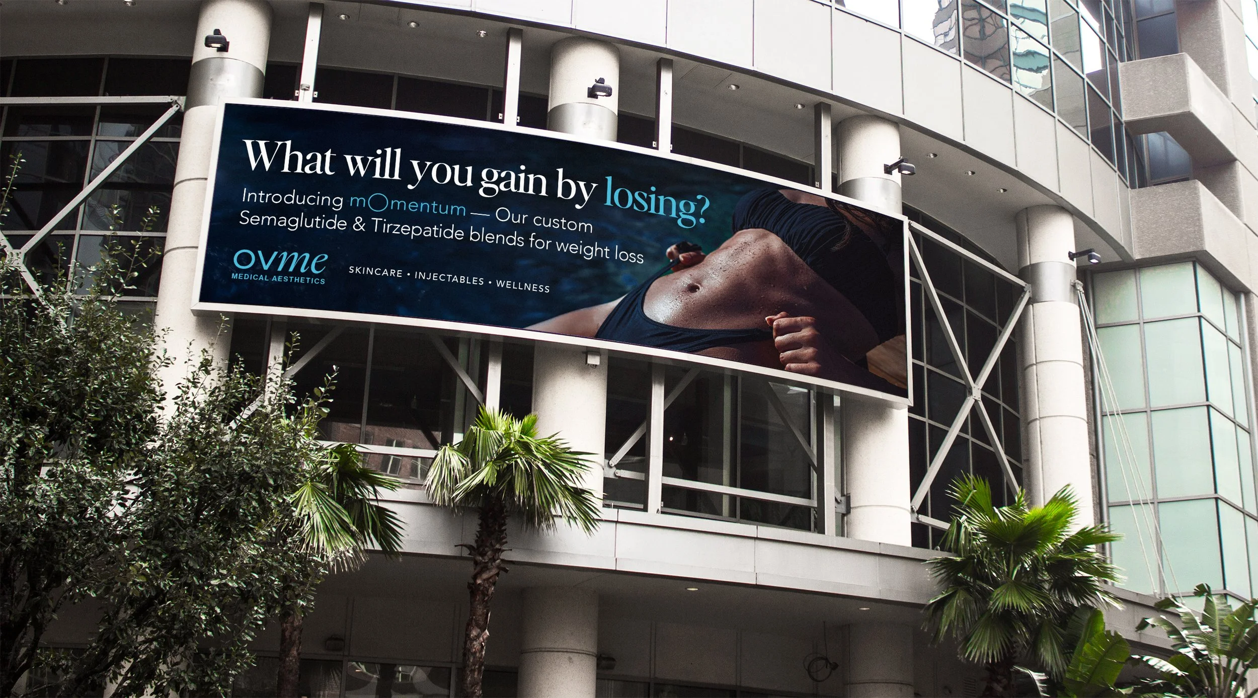
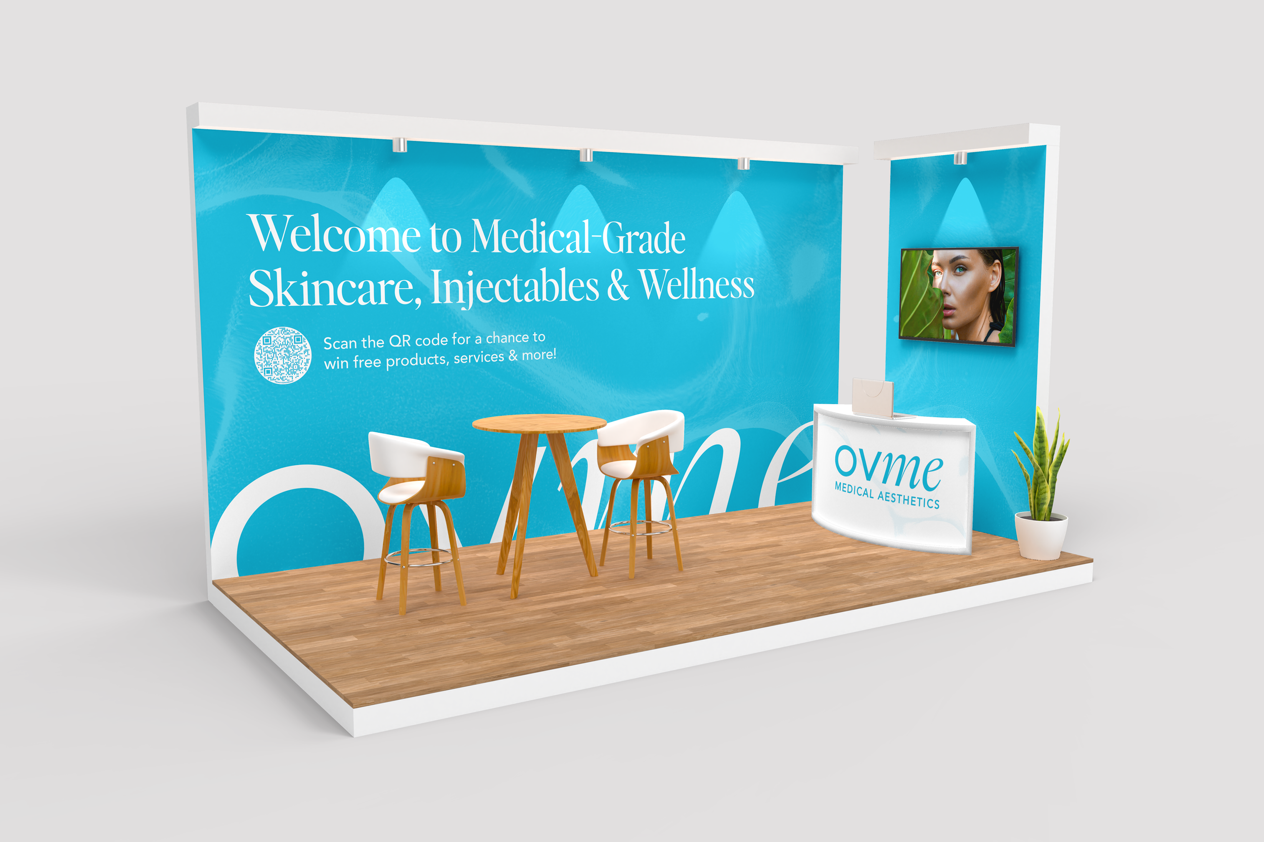
With OVME undergoing seven redesigns in just two years, its visual identity had become inconsistent and unclear. As Creative Lead, I streamlined the brand’s aesthetic by refining its core elements—logo, typography, and color scheme—ensuring a polished, high-end look. Brand testing revealed that many misread or mispronounced the name, even mistaking OVME for an ovarian clinic. To address this, I redesigned the logo using a dual-typeface approach to improve clarity and recognition. I also removed design elements, like doodles, that weakened the brand’s premium appeal. To maintain consistency across marketing, signage, packaging, and digital platforms, I developed comprehensive brand guidelines, solidifying OVME’s identity as a modern, sophisticated aesthetic brand.


